7 Marker tips

Markers require an all or nothing attitude. They can smell hesitance so they work best when you don't overthink it.

Just go for it! Here’s a few really quick tips I use on a daily basis to help me master markers.

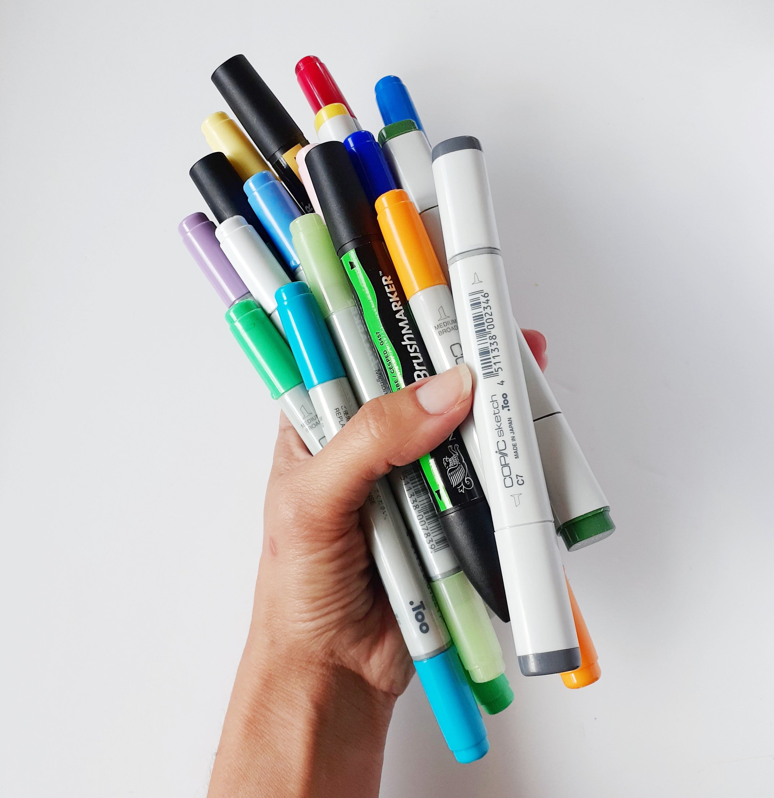
Here are a few tips to help you feel more comfortable getting your alcohol markers on the page.

  • Start by fencing/ framing areas of colour to achieve a neat and clean finish. Creating a frame or boundaries to work within helps to achieve a clean, neat result and helps to outline and breakdown colour blocks into smaller, more manageable areas.

  • Work quickly and always keep moving so you don’t get spots of over inking. Moving too slowly with markers can cause patches of excess ink, leading to wastage and oversaturation on the paper.

  • Use the flick/feather technique to get an even coverage of colour without ink wastage on overlapping patches. This techniques allows for coverage of colour with out too much overlap and helps to avoid creating lines in the blocks of colour.

  • Start with the lightest colour and build through to the darkest colour. I know this is a slightly controversial opinion because this approach uses more ink and takes a little longer but I believe you achieve a better result working this way. Markers are not very forgiving and it can be extremely hard to correct and mistakes as the colour is so bold, working light to dark helps to eliminate colour mistakes.

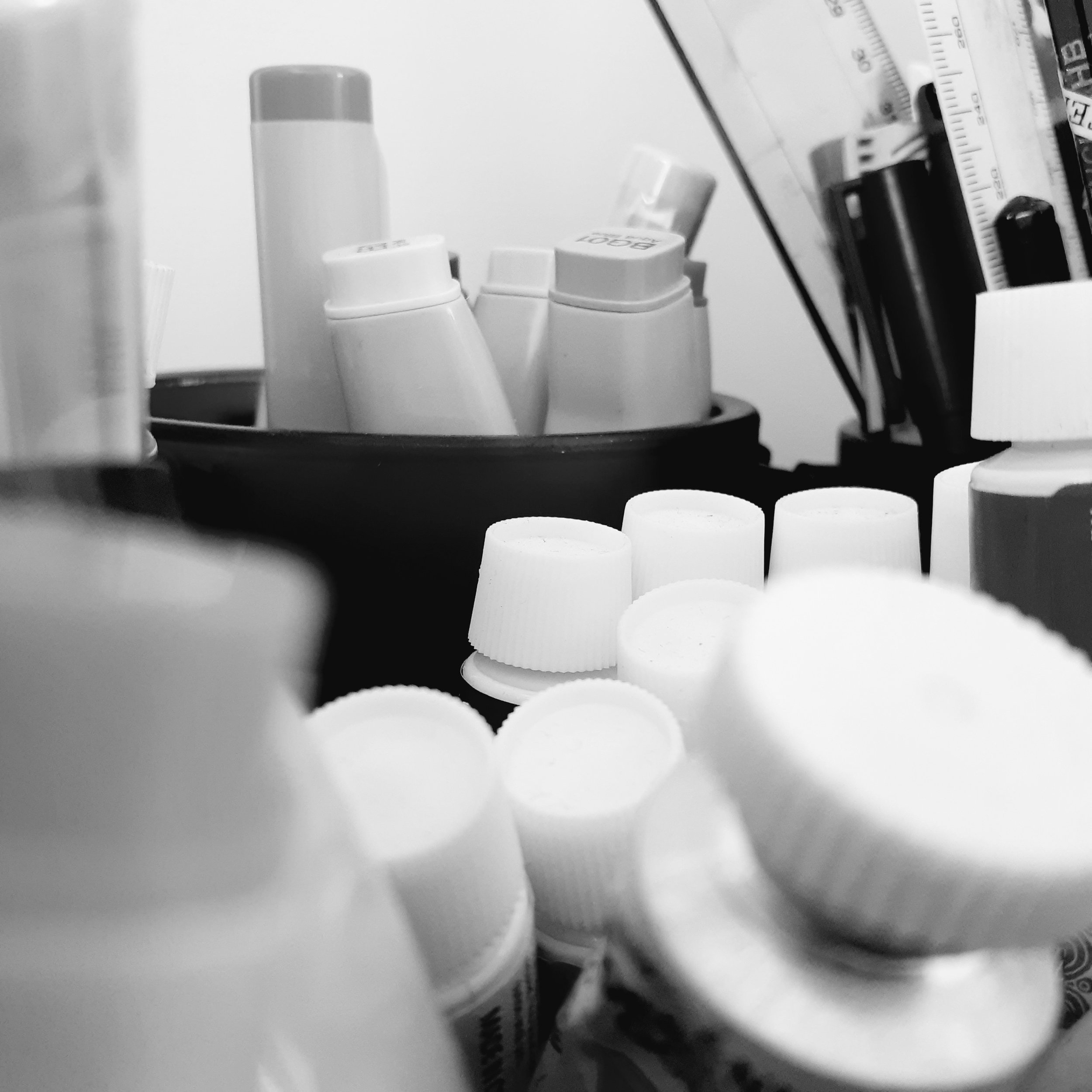
  • Use a suitable paper for alcohol markers where possible (I use X-press It blending card) to eliminate peeling and bleeding. Markers require paper that can hold alot of liquid, paper that doesn’t bleed through and soak up to much colour helps to avoid wasting ink.

  • Blend and build depth using multiple layers of the same colour. While there is an extensive range of colours available in alcohol markers, you can achieve an even graduation and blending of colours but using multiple layers of the same colour

  • Leave white patches to create highlights and use really dark shades to contrast the white spaces. Don't be scared to use a really dark grey or black to create contrast. Creating contrast can bring light bright colours to life and create depth and form on the page.

Markers take a while to master, practice makes perfect.

Alcohol makers and why I love using them.

Intimidating, unforgiving and bold is the best way to describe alcohol markers. This is exactly why I love them.

I was initially introduced to alcohol markers while studying at University. I was required to use them for an assignment in an interior design unit and I absolutely hated them. I avoided them until the very last minute and didn't end up with a very good result.

I kept the markers and revisited them many years later with slightly more determination. I set myself a drawing challenge, 100 drawings in 100 days, in the hope to use this challenge to master my alcohol markers. It didn't take long before my hesitance turned to appreciation and then into a total obsession.

Here's why :

Alcohol markers are translucent, bold and come in an extensive range of vibrant colours which makes them perfect for drawing jewellery and gemstones!

With a quick dry time they can be layered and blended to create depth and form.

A variation of nib sizes are available and the super brush tip found on the Copic sketch and ciao markers allows for tiny details, smooth blend and fine lines. (The super brush tip is by far my favourite because of its ease of use)

My collection predominantly includes Copic and Promarkers, and while they can initially be expensive, I can refill my Copic markers as well as replace nibs so the longevity and reduced impact on the environment are a benefit.

Alcohol markers are not a traditional jewellery rendering medium but they are perfect for my realistic style and perfect for reinforcing a fresh approach to a traditional skill.

Tools of the trade - Jewellery Illustration

What do you actually need when you are starting out in manual Jewellery Illustration?

I'm a big believer in using and making the most of what you have. Not blaming the tools but learning to master the tools you have access to. Don't get me wrong, I currently have an extensive selection of art supplies but I have mindfully added to my collection over the past 19 years. When I started I purchased a a small selection of drawing tools and learnt to use that small selection.

There is is a quote by Arthur Ashe that sums this up perfectly.

"Start where you are, use what you have and do what you can."

You don't need a massive budget to spend on supplies at the beginning. If all you have is a lead pencil then sharpen it and start drawing. Learn to use that lead pencil in everyway physically possible and master that lead pencil. My illustration tutoring with Jewellers often centres around learning to use the basics ( a packet of coloured pencils, ruler and a mechanical pen) A jeweller or designer doesn't always require a high end illustration to communicate design details to their clients.

But, If you are looking to move on from your lead pencil and purchase some additional drawing tools then here is what I recommend purchasing/using if you are just starting out with Jewellery illustration.

  • A mechanical pencil with 0.30mm size lead or a mechanical pencil with 2mm lead and a relevant sharpener to keep it nice and sharp.

  • Erasers, a 2mm mechanical eraser is great for small details but a larger option is also recommended.

  • A ruler and or set squares (45 and 90 degree).

  • Paper or card to draw on. (Depending on referred drawing mediums)

  • A pack of coloured pencils.

  • Templates. Round and oval templates as well as gemstone shaped templates can help when drawing designs. (I love using Timely Templates - Diamonds and gemstones)

  • White gouache and a small tipped brush size 00 or 000 is recommended (and something to put the paint on like a plate or recycled lid - I use a white perspex off cut)

While there is a lot more you can use, add as you go and as you grow in confidence. Start with the basics, you don't need everything at once. Master what you do have before you add too much because having a full stationary / art supply draw can sometimes be overwhelming and unnecessary.