
When it comes to creating stunning illustrations, choosing the right paper can make all the difference. The texture, color, and type of paper you use can significantly impact the outcome of your artwork. I’ve looked at the paper I use and also common paper types I find in the world of jewellery illustration and created a list.

Different Textures
Texture plays a crucial role in how your illustrations will look and feel. Here are some common paper textures and their uses:
Smooth Paper: Ideal for detailed work and fine lines, smooth paper is perfect for pen and ink illustrations. It provides a clean, sleek surface that allows for precise control over your medium. This is my favourite because it’s a clean slate and lets me explore texture with my illustration techniques instead of being dictated by paper choice.
Hot Pressed Paper: This type of paper has a smooth, velvety finish and is excellent for watercolors. The smooth surface allows for even washes of color and fine detail work.
Cold Pressed Paper: This paper has a slightly textured surface. It's versatile and can be used for watercolors, as well as other mediums like acrylics and gouache. The texture adds depth and interest to your artwork.
Rough Paper: With a highly textured surface, rough paper is perfect for creating bold, expressive illustrations. It's commonly used for watercolor paintings where the texture can enhance the visual appeal of the piece. this paper can be a little tricker to use if you are trying to communicate smooth metal surfaces but suits artistic styles rather than technical details.

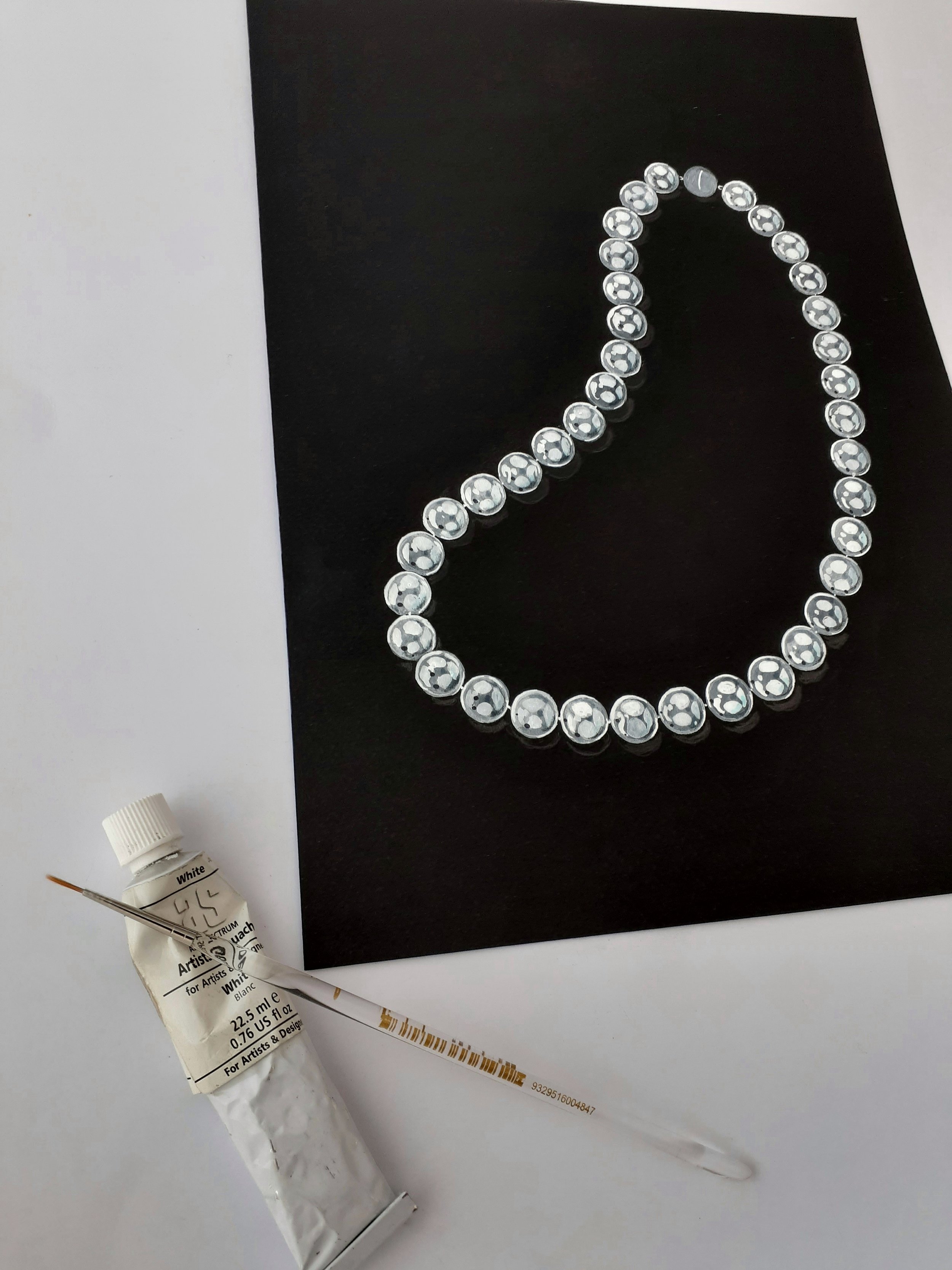


Contrast and Highlights: Colored paper allows you to play with contrasts. Light-colored or white pencils and markers stand out brilliantly on darker paper, creating striking highlights and adding depth to your illustration.
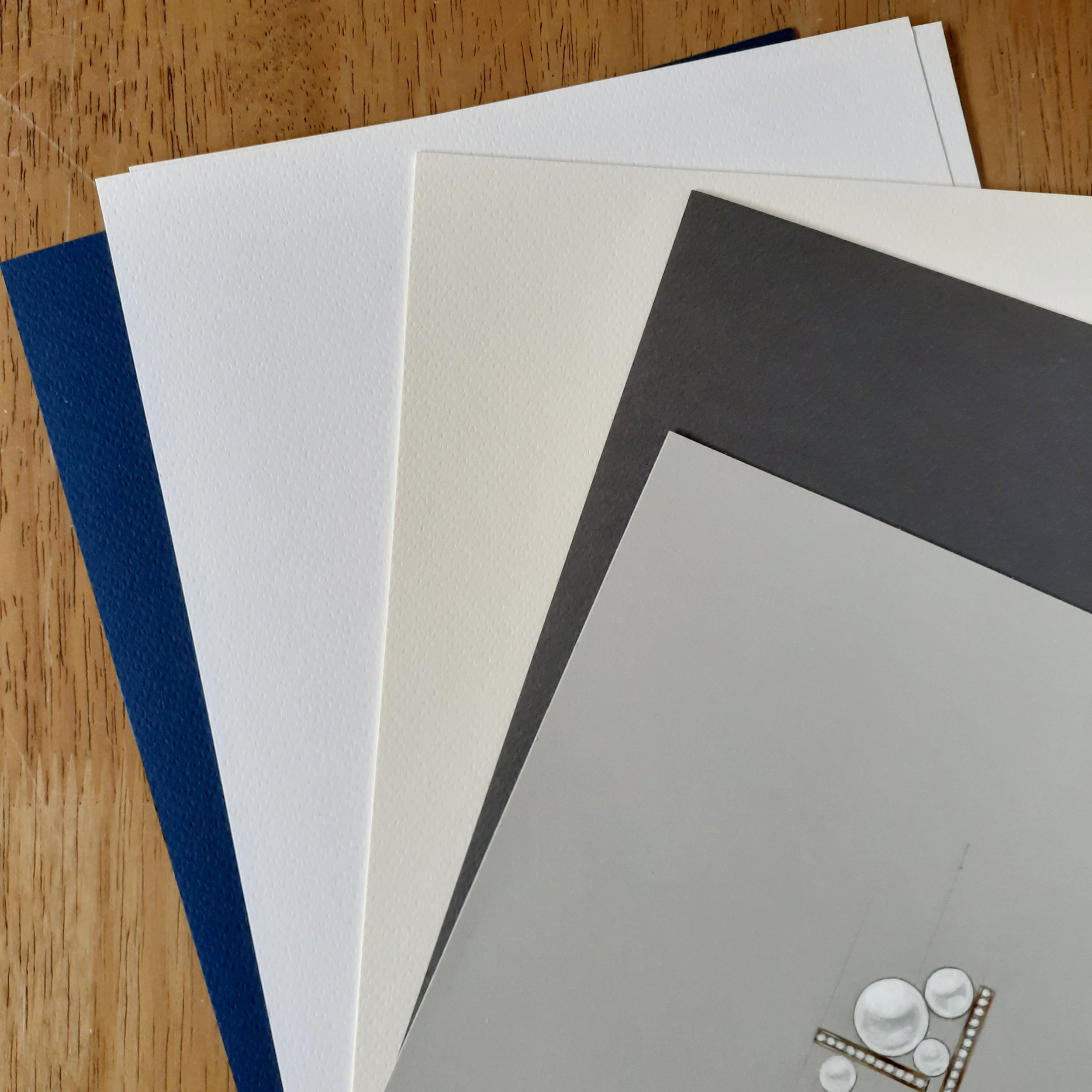
Color: Setting the Mood & Enhancing Contrast
The colour of the paper itself can influence the overall effect of a jewellery illustration. While white paper is an easy default choice, experimenting with toned backgrounds can add drama and enhance metal and gemstones.
White Paper: Classic choice for jewellery sketches, ensuring clarity and precision in technical drawings. Super clean appearance so suits more of a modern approach.
Grey/Toned Paper: Provides built-in mid-tones, allowing designers to use both highlights and shadows effectively. Great for creating depth in metalwork illustrations or great for mediums such as gouache. More of a traditional colour choice with gouache as it was used for hundreds of years it delivers a more historical feel.
Black Paper: Creates striking contrast for white highlights, making diamonds and platinum settings pop. Perfect for pearls and white diamonds. Black paper is a little more unforgiving that whites or grey but well worth the effort once you get the hang of it.
The right paper can transform jewellery concepts from rough ideas into polished illustrations or really help to leverage a particular style. By understanding how texture, color, and paper type influence design work, jewellery artists can experiment freely and bring their visions to life with greater depth and accuracy. Whether creating high-contrast gemstone studies, soft watercolor effects, or technical precision sketches, paper choice plays an essential role in the creative journey and communication to clients.