White and Grey: Perfecting the Details
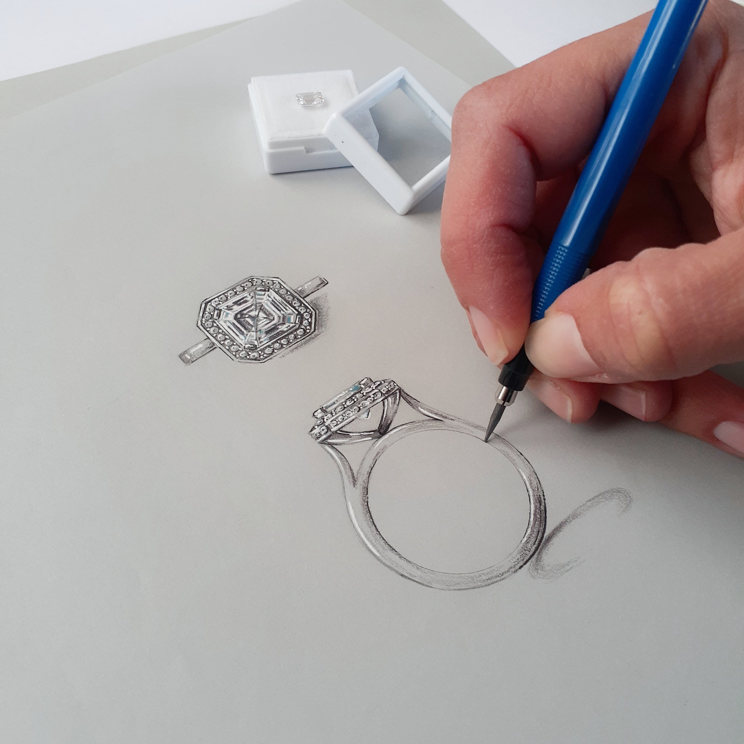
When it comes to my jewellery designs and illustrations, I prefer a realistic approach. Through numerous trials and errors, I have discovered several helpful techniques to achieve the level of realism, dimension and depth I strive for. The key to creating a polished and sophisticated illustration in a realistic style is in the white highlights and dark definition.
These techniques apply to my client workshop sketches and manufacturing drawings, as well as high-end artwork. They are not time-consuming and do not require an extensive toolset.
With just a few materials, including white gouache, a fine brush, a white gel pen, a grey pencil or marker, and a fine black pen or marker, you can add defining details to any illustration in no time.
Using white gouache, you can produce white highlights that give a 3D appearance to the jewelry item and act like a final polish. The contrast between the bright colors, shadows, and a clean, crisp white highlight finish an illustration by outlining a high point or a focal point that draws you into the design.
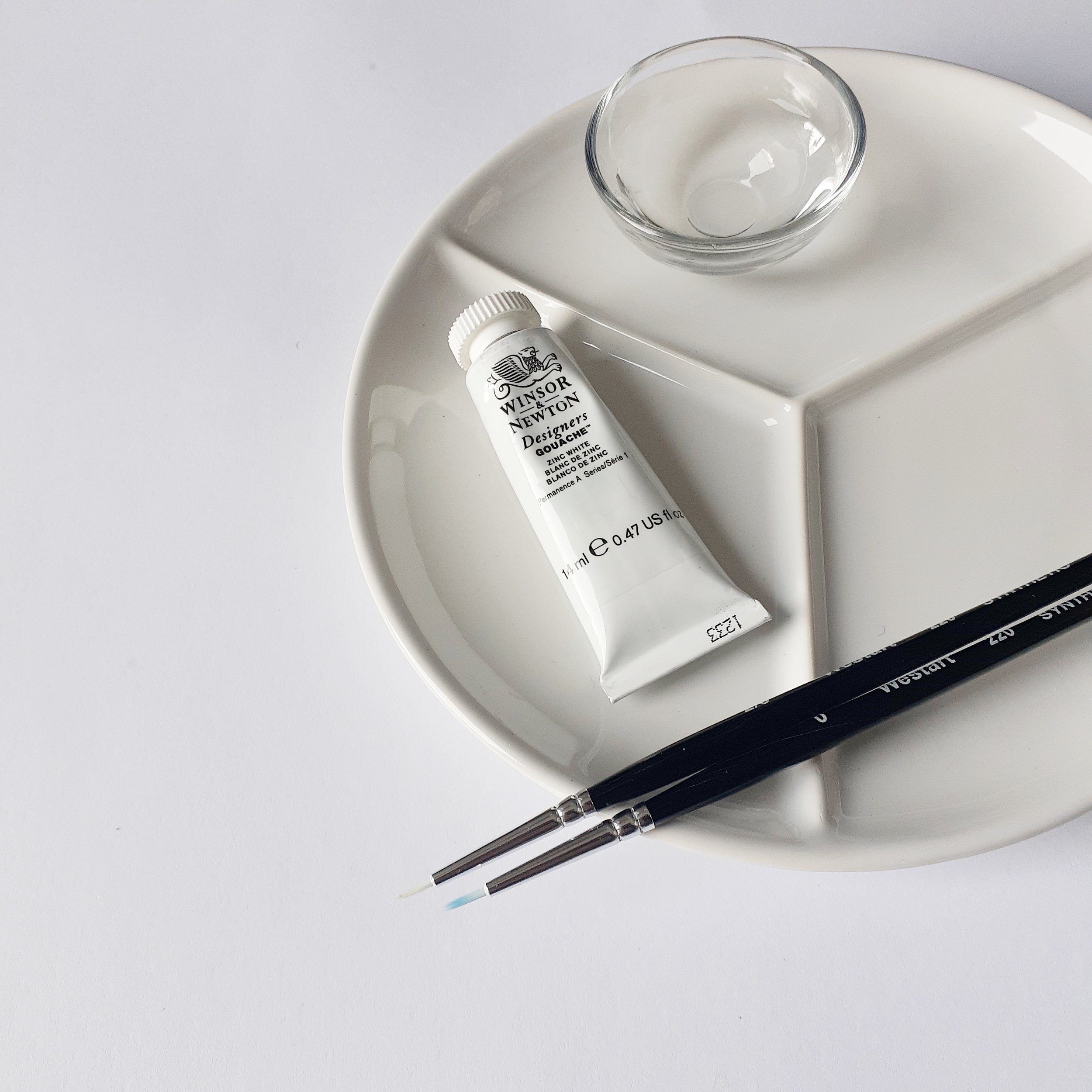
I recommend using Winsor and Newton Zinc or Permanent White gouache in a tube for the best results. Tubes are easier to use than containers and professional-grade gouache offers vibrant colors and can be expensive but worth the investment.
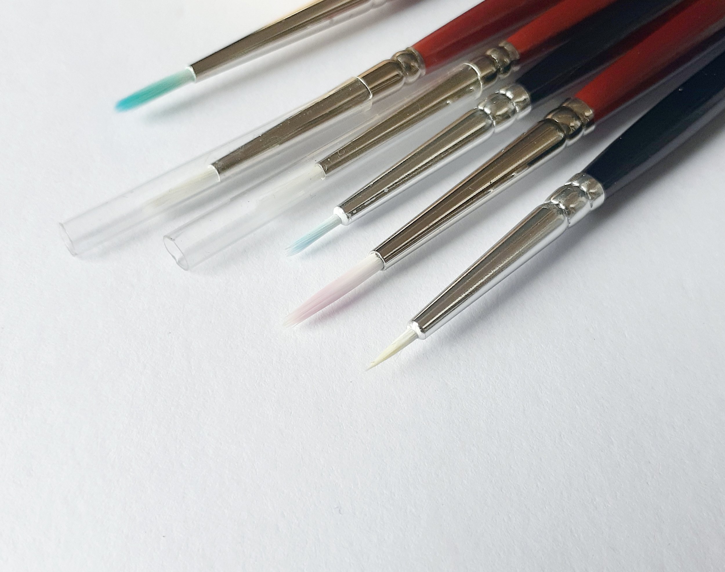
Synthetic brushes work well for gouache, Round brushes (sizes 0000-6) for detail work (I use a size 000 or 00)
Other alternatives that also work are White gel pen, White posca (acrylic paint) pens and a white charcoal pencil. While these offer great options for travelling or a quick highlight I don’t always feel they achieve a consistent result.


To create shadows, use a grey pencil or marker to provide contrast to the white highlights and emphasize the colors and shades in the illustration. Apply the shadow at the lowest point to define the boundary of the jewelry item and reinforce its 3D form.
I suggest using C1 and C3 Copic markers for most of your shadowing needs. Alternatively a lead pencil can also be utilized to create contrast and shadows.
These small additional will make a difference to creating form and shape that highlights design details!